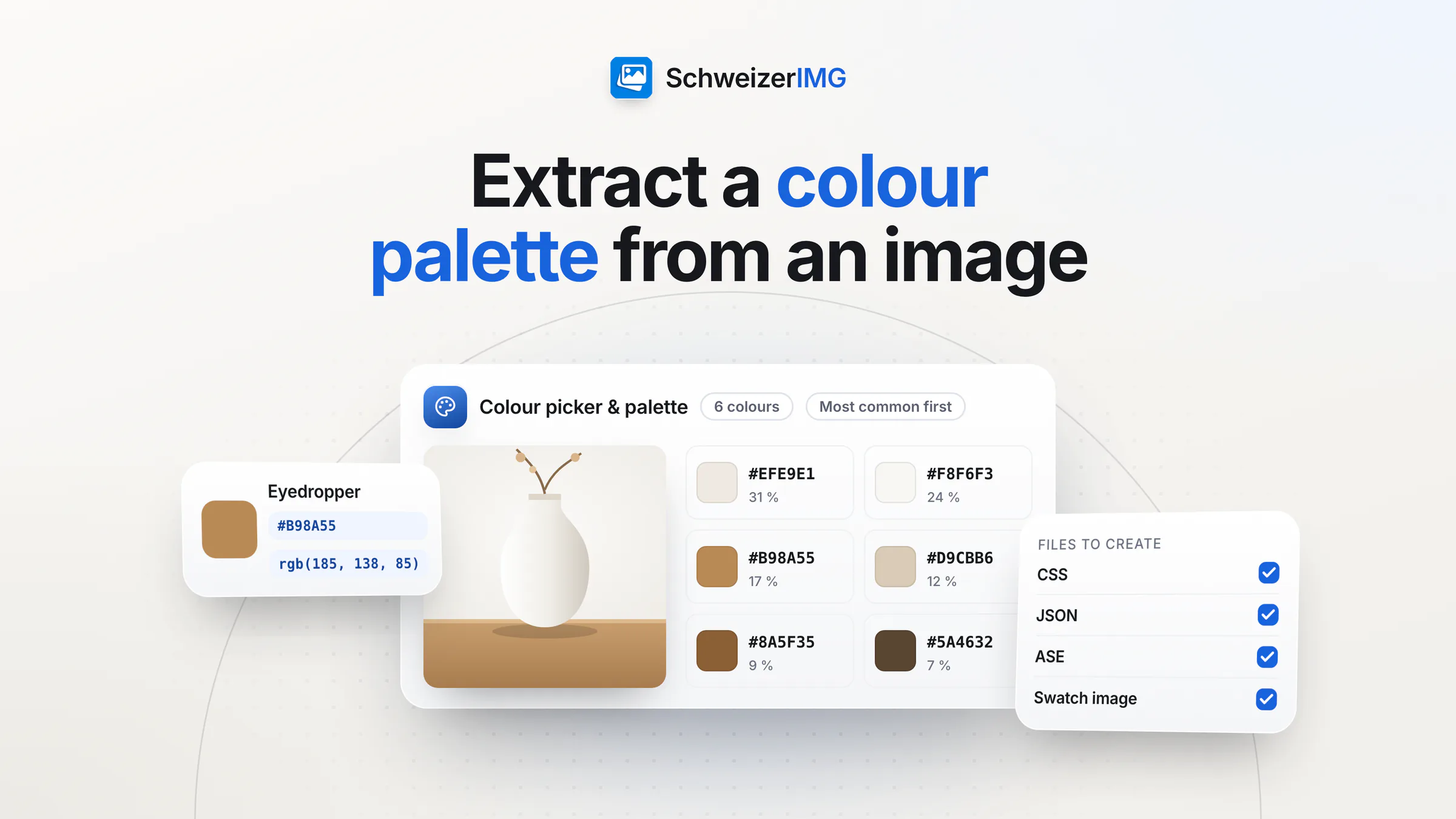
To extract a colour palette from an image, open Colour picker & palette and add the picture — a logo, a product photo, a shot of your shop window. The tool finds the image's dominant colours (between three and sixteen; six by default), gives each one in HEX, RGB, HSL, HSV, OKLCH and approximate CMYK, and exports the set as CSS variables, JSON, an .ase swatch file for design programs and a swatch image.
A palette is only the start. This article shows how to extract it, which colour notation to use where, how to check that text in your colours stays readable, why the same colour looks different on screen and on paper, and how to put the palette to work in other tools.
How to extract a colour palette from an image
- 1
Choose a good source image
One image per run. A logo or a graphic with flat colours gives exact values; a photo gives the colours that dominate it, which is often what you want for a mood or a presentation theme. For an animated image, the first frame is used.
- 2
Set the number of colours and the order
Pick how many colours to extract and how to sort them: Most common first, Light to dark or By hue. Fewer colours give a calmer palette; more show the nuances.
- 3
Pick exact colours where it matters
The palette groups similar pixels, so its colours are representative rather than taken from one spot. With the eyedropper you read the exact value of any pixel instead — useful for the precise blue of a logo.
- 4
Choose the files to create
Under Files to create: CSS variables (.css), JSON (.json), a swatch exchange file (.ase) and a swatch image (.png). Set a prefix for the CSS variable names, for example
brand, to get--brand-1,--brand-2and so on. - 5
Copy or download
Copy a single value, or download the files and hand them to whoever builds your website, slides or print material.
HEX, RGB, HSL and more: which colour value to use where
| Notation | Where it is useful |
|---|---|
| HEX | Websites, CSS, most colour fields in apps and presentation software — and the colour fields of SchweizerIMG's own tools |
| RGB | Screen design and software that asks for red, green and blue separately |
| HSL | Building lighter and darker shades of one colour, because lightness is a value of its own |
| HSV | Colour pickers that work with hue, saturation and brightness |
| OKLCH | Modern CSS; its lightness follows what the eye perceives, which helps with even tints |
| CMYK (approximate) | A first idea of ink percentages — not a print-ready value (see below) |
All values refer to the sRGB colour space, the common space of the web. If a photo uses a wider colour profile, it is converted to sRGB first and very saturated colours are clipped; the tool's report says when that happened.
Check contrast before you use your palette for text
A palette taken from a beautiful photo often has several mid-tones that look good together but are hard to read on top of each other. The Web Content Accessibility Guidelines (WCAG) 2.2 set minimum contrast ratios at level AA: 4.5:1 for normal text and 3:1 for large-scale text (at least 18 point, or 14 point bold). User interface components and graphics that are needed to understand content need 3:1 against adjacent colours. Text that is part of a logo has no contrast requirement.
Colour picker & palette gives you exact values; it does not calculate contrast ratios. Enter the HEX values of a text colour and its background into a contrast checker before you settle on a pair. A few rules of thumb:
- Pair extremes for body text. The darkest colour of the palette on its lightest one is usually the safest choice for text.
- Keep vivid mid-tones for accents — large headings, buttons (after a contrast check), lines and icons.
- Sort by Light to dark to see at a glance which colours can carry text and which belong in the background.
- Check both directions if your website or slides have a dark version: light text on a dark colour is a separate pair.
Screen and print: why the same colour looks different
Screens mix light from red, green and blue; printers put cyan, magenta, yellow and black ink on paper. The two can't reproduce exactly the same range of colours, and both vary — from one screen to the next, from coated to uncoated paper. A bright brand blue that glows on a monitor can turn duller in print. How many pixels a print needs is a separate question, covered in pixels, DPI and print size.
- The CMYK values are approximate. They come from a simple formula without an ink or paper profile. Use them as a starting point, not as print specifications; SchweizerIMG doesn't create CMYK files.
- Define your brand colours per medium once. Keep a HEX value for screens and have your print shop or designer set the matching print values and check a proof.
- Write the values down. Keep the exported CSS or JSON file with your brand documents, so every new slide deck and web page uses the same colours.
Use your palette in Pad, Add border and Watermark
The colour fields of SchweizerIMG's tools take HEX values, so a palette carries straight into your images:
- *Pad* — fill colour: put product photos or team pictures on a square or a fixed aspect ratio in your brand colour instead of white. The workflow for a whole shop is in preparing product photos for your online shop.
- *Add border* — border colour, the colour between the lines of a double frame and the caption colour of a polaroid frame: a consistent frame for social media posts or a presentation.
- *Watermark* — text colour, outline and shadow colour: a mark in your brand colour that stays legible on light and dark photos. What a mark can and can't protect is in what a watermark protects.
These are transform and editing tools; the palette itself is among the analysis tools. You can pass a result from one tool to the next without downloading it in between — see chaining tools.
Agencies often extract palettes from material that isn't public yet: a client's new logo, a campaign key visual, product shots before launch. SchweizerIMG reads the image in your browser; it is never sent to or stored by us, and per run our server receives only the tool and the outcome. More on the security page and on image tools for marketing and web agencies.
Frequently asked questions
How many colours should a brand palette have?
There is no fixed number. Many brands work with one or two main colours, an accent and a few neutrals. Extract more colours than you need — up to sixteen — and keep the ones that carry the brand; the rest is useful for backgrounds and charts.
Why does a palette colour differ from the pixel I picked?
The palette groups similar pixels and gives you a representative colour for each group, weighted by how much of the image it covers. The eyedropper reads one exact pixel. When an image has no more distinct colours than you asked for — a flat logo, for example — the palette contains exactly those colours.
Can I import the palette into design or presentation software?
Many design programs import .ase swatch files. For slides, the swatch image (.png) is the quickest reference, and each colour's HEX value can be typed into the software's colour field. The CSS file is for websites, the JSON file for developers.
Are the CMYK values ready for print?
No. They are uncalibrated approximations without an ink or paper profile. For print, ask your print shop or designer for the values that fit the paper and the printing process.
Try it with your logo: start from your first tool, see which plans include Colour picker & palette on the pricing page, or create an account.
General information
This page is general information and marketing content. It simplifies the contrast criteria of WCAG 2.2 and the differences between screen and print colours, which depend on the devices, the paper and the printing process. For an accessibility review of your website or print-ready brand colours, please consult a qualified professional.