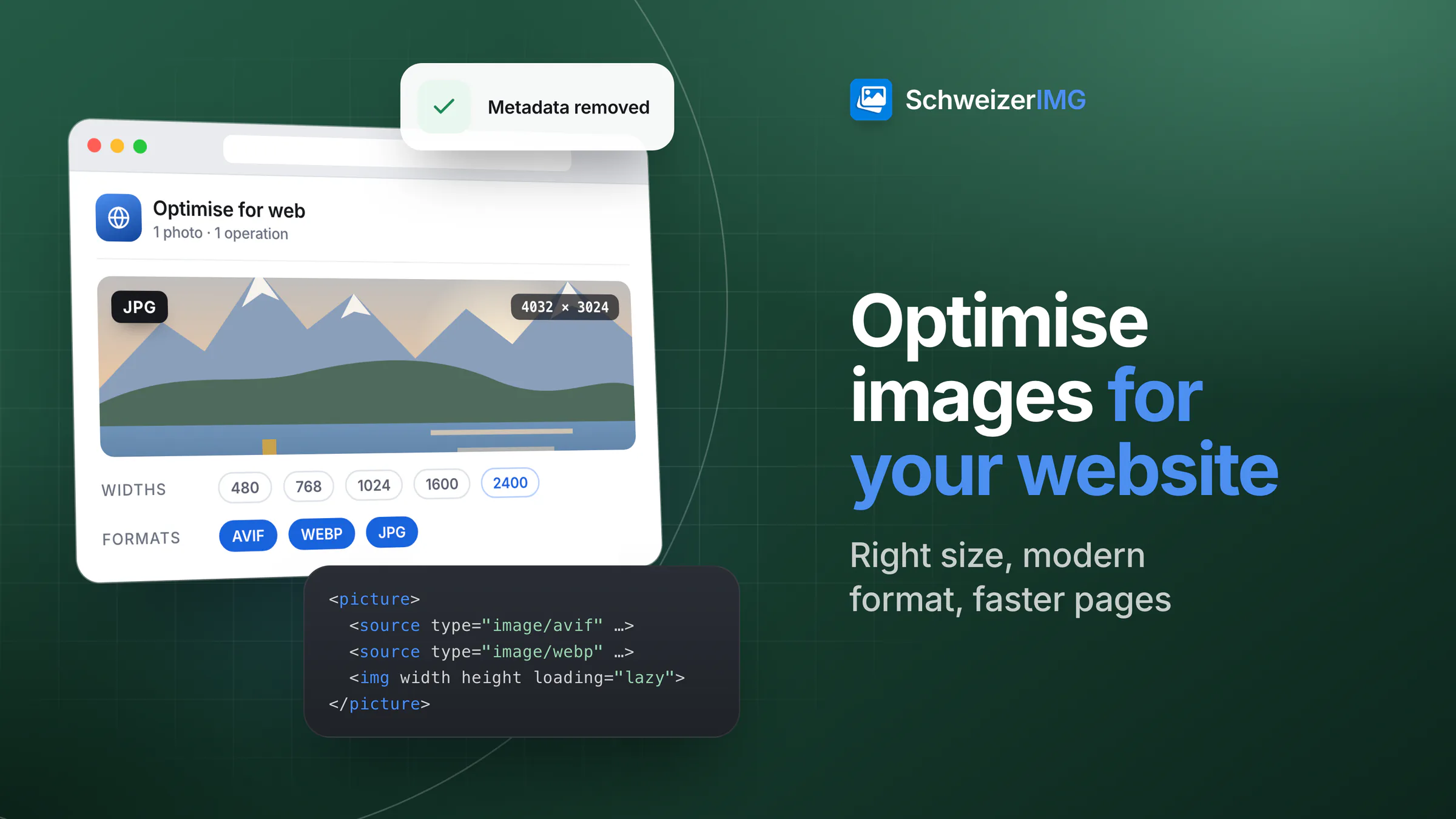
To optimise images for your website, do four things in this order: resize each image to the width at which it is actually displayed (about twice that for high-density screens), save it in a modern format such as WebP or AVIF with a JPEG or PNG fallback, compress it at a quality where the difference is not visible, and remove the metadata nobody needs. Then let the HTML do its part: several sizes in srcset, width and height attributes, and lazy loading for images further down the page.
This guide explains why each step matters, which settings to start with, and how to do it all in your browser with SchweizerIMG — for one image or a whole folder.
Why images decide how fast your website loads
On most websites, images make up a large share of the bytes a browser has to download. Every unnecessary kilobyte costs time on a mobile connection, and the largest image near the top of a page is frequently the element visitors are waiting for. Search engines take page speed into account in their own ways, so lighter images help visitors first and visibility second. The usual reasons an image is too heavy:
- Too many pixels. A photo straight from a phone or camera is several thousand pixels wide; a content column rarely shows more than a fraction of that.
- An unsuitable format. A photo saved as PNG is many times larger than it needs to be; a screenshot saved as a low-quality JPEG looks blurred.
- Too high a quality setting. Above a certain point, a higher quality value only adds bytes the eye cannot see.
- Invisible extras. Camera details, GPS coordinates, edit histories and embedded previews travel with every download.
Which image dimensions does a website need?
Start with one question: how wide is this image on the page? Check it in your layout or with your browser's developer tools. Phones, tablets and many laptops have high-density screens that use two or more device pixels per CSS pixel, so an image displayed 800 pixels wide looks sharp when the file is about 1,600 pixels wide. Going much beyond twice the display width rarely improves what visitors see, but it always adds weight. Typical starting points:
| Where the image appears | Displayed width (example) | File width to export |
|---|---|---|
| Full-width hero or banner | 1,200–1,600 px | Several sizes up to about 2,400 px, offered with srcset |
| Image in a text column | 700–800 px | About 1,400–1,600 px |
| Card or teaser image | 350–400 px | About 700–800 px |
| Thumbnail or logo in a list | 100–150 px | About 200–300 px — or SVG for logos |
In SchweizerIMG, Resize with “Longest side” or “Fit inside a box” brings a whole batch to the size you need, with high-quality resampling and optional sharpening after reducing. Smaller images are not enlarged unless you allow it — enlarging adds pixels, not detail.
Modern formats: WebP and AVIF with a fallback
The format decides how efficiently the pixels are stored. For photos on the web, the two modern formats usually give clearly smaller files than JPEG at the same visible quality:
- WebP — supported by all current major browsers, with transparency and animation. A safe default for photos and graphics.
- AVIF — often smaller still, especially for small file sizes, and supported by current versions of the major browsers. Encoding takes longer, which you notice with large batches.
- JPEG — the fallback that works everywhere, including older browsers, e-mail and almost any software.
- PNG — for screenshots, interface graphics and images that need exact pixels or transparency; too large for photos.
- SVG — for logos and icons that are drawn rather than photographed: sharp at every size and usually tiny.
With the HTML <picture> element, the browser takes the first format it supports, so you can offer AVIF and WebP and keep JPEG as the safety net. The strengths and limits of each format are compared in WebP vs AVIF vs JPEG vs PNG.
Compression settings for website images
Lossy formats trade a little invisible detail for much smaller files. The right setting depends on the image: a detailed landscape needs a higher quality than a portrait with a soft background (background in image compression explained). Rather than guessing a number, let the tool measure it. Compress image offers four modes:
- Automatic, with the levels Light, Recommended or Strong — it searches for the lowest quality that still meets a measured similarity to the original for the chosen level.
- Choose the quality — a fixed value from 1 to 100, if you already know what works for your site.
- Target file size — compresses until the image fits a limit and, if you allow it, also reduces its dimensions.
- Lossless only — for screenshots and graphics that must stay pixel-exact.
With “Save as” set to “Smallest of WebP, AVIF and JPEG”, the tool tries those formats and keeps the lightest result; the result is never larger than the original. To check it, Compare images shows original and result with a slider or side by side, together with similarity measures.
Then remove what nobody sees. Camera model, serial numbers, GPS coordinates, edit history and embedded previews are of no use to website visitors. Remove metadata deletes it losslessly, without re-encoding the pixels; Resize, Compress image, Convert format and Optimise for web have their own metadata setting as well. What these details can reveal is explained in what your photos reveal.
Let the HTML help: srcset, width and height, lazy loading
Optimised files are half the job; the other half is how the page loads them — general web practices for any website system:
- `srcset` and `sizes` offer the same image in several widths, so a phone downloads a small version and a large screen a large one.
- `width` and `height` attributes tell the browser the image's proportions before it arrives. It reserves the space, and the text below does not jump when the image appears.
- `loading="lazy"` postpones images further down the page until the visitor scrolls towards them. Do not use it for the main image at the top: that one should load right away.
- One large image at the top, not five. The largest element visible when the page opens is what visitors perceive as “loaded”.
That last point has a name: Largest Contentful Paint (LCP), the time until the largest image or text block in the visible area is rendered. It is defined in a W3C specification and is one of the measures commonly used to assess page speed. A light, correctly sized hero image that is not lazy-loaded is one of the most direct ways to improve it.
Optimising website images with SchweizerIMG
Every step runs in your browser: images are processed on your device and never uploaded to us, which matters for pictures that are not yet public (more on the security page). Each tool processes a whole batch in one run, and one run is one operation, however many files it holds.
- 1
Resize to the display size
Open Resize, add your images and choose “Longest side” or “Fit inside a box” with the width you determined — twice the display width for high-density screens.
- 2
Compress or convert
Use Compress image with “Smallest of WebP, AVIF and JPEG”, or Convert format when you need one specific format. Continue with another tool passes the results on without downloading them in between — see continuing with another tool.
- 3
Remove metadata
Finish with Remove metadata, or set the metadata option of the previous tool to “Remove”.
- 4
Download and publish
Save the results right after the run — they exist only in the open tab — then publish them as usual.
For your own website, Optimise for web covers these steps in a single run: it creates several widths (by default 480 to 2,400 pixels, never larger than the original) in AVIF, WebP and JPEG, removes metadata by default, and writes a ready-to-paste <picture> snippet with srcset, sizes, width, height and lazy or immediate loading, plus a manifest of all files. Which plans include Optimise for web is shown on the pricing page. More on batches: processing many images at once.
Frequently asked questions
What is the best image size for a website?
There is no single number: export each image at its displayed width, and about twice that for high-density screens. A full-width hero benefits from several sizes offered with srcset.
Should I use WebP or AVIF on my website?
Both are good choices. WebP is the safe default with broad support; AVIF often produces smaller files but takes longer to encode. Offering both in a <picture> element with a JPEG fallback gives every browser the best format it can show.
Should every image be lazy-loaded?
No. Lazy loading helps for images further down the page. The main image visible at the top should load immediately — delaying it makes the page appear slower, not faster.
Does removing metadata make images smaller?
Usually only a little: on most photos, metadata is a small part of the file. Embedded previews, large colour profiles or long edit histories can add more. The main reason to remove it from web images is privacy rather than size.
Ready to make your pages lighter? Open the optimisation tools, read how compressing and converting works, follow the workflow for shop product photos, or create a free account.
General information
This page is general information and marketing content. It simplifies how browsers load images and how page speed is measured; browser support and the criteria search engines use change over time. For decisions about your own website, please consult a qualified web developer.